Architecting for Growth
When I first joined Raken, features in our web application were painfully fragmented.
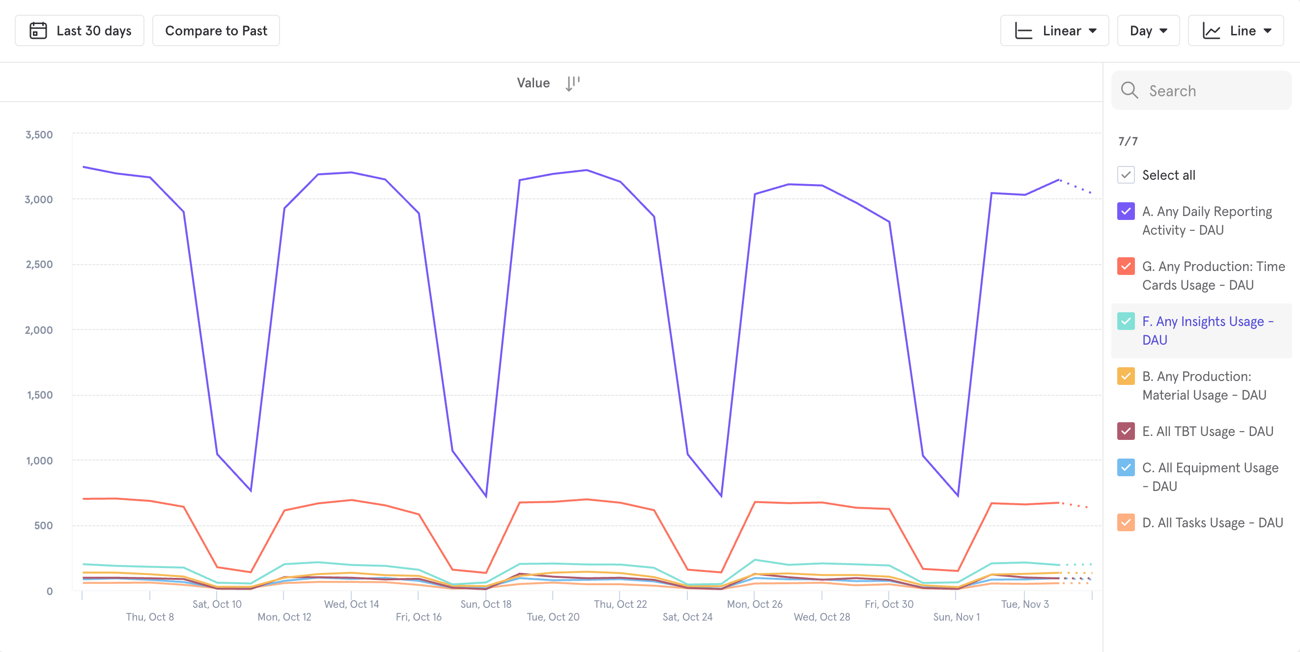
Through customer feedback and event tracking, the team had come to learn that existing features beyond our daily reporting tools were not being adopted by our users.
Engineering teams were spending months on new features only to find that adoption was incredibly low even though these were highly asked-for features.
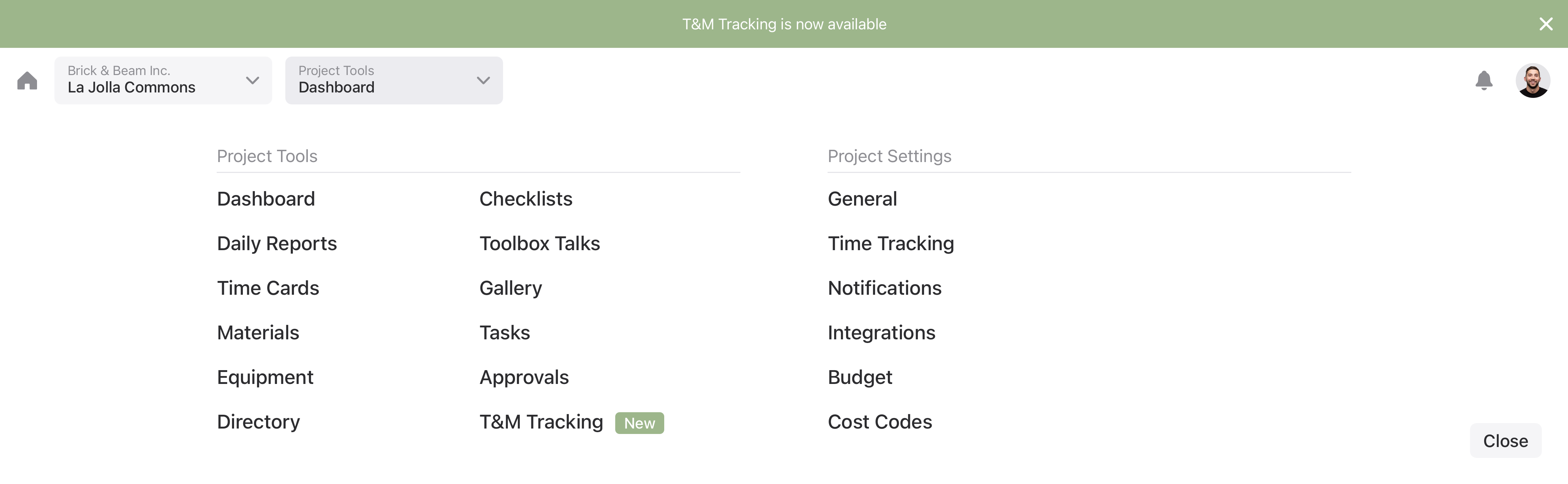
From production tracking, timecards, and safety talks, to checklists. Users had to navigate away from the daily report in order to discover them.
My role was to work with stakeholders across the organization in order to understand how changes to the navigation might affect operations and to envision how we might improve the experience.
We knew from research that user’s who were taught about our extended features were much more likely to continue using them after their training period ended. We also knew that the needs of companies using these features was highly variable; there was no single flow that could work for everyone.
We asked: what would happen if we consolidated the project feature navigation into a single menu?
Even though this project was primarily an improvement to the Raken web experience, our mobile apps also needed to be updated to follow the same patterns.
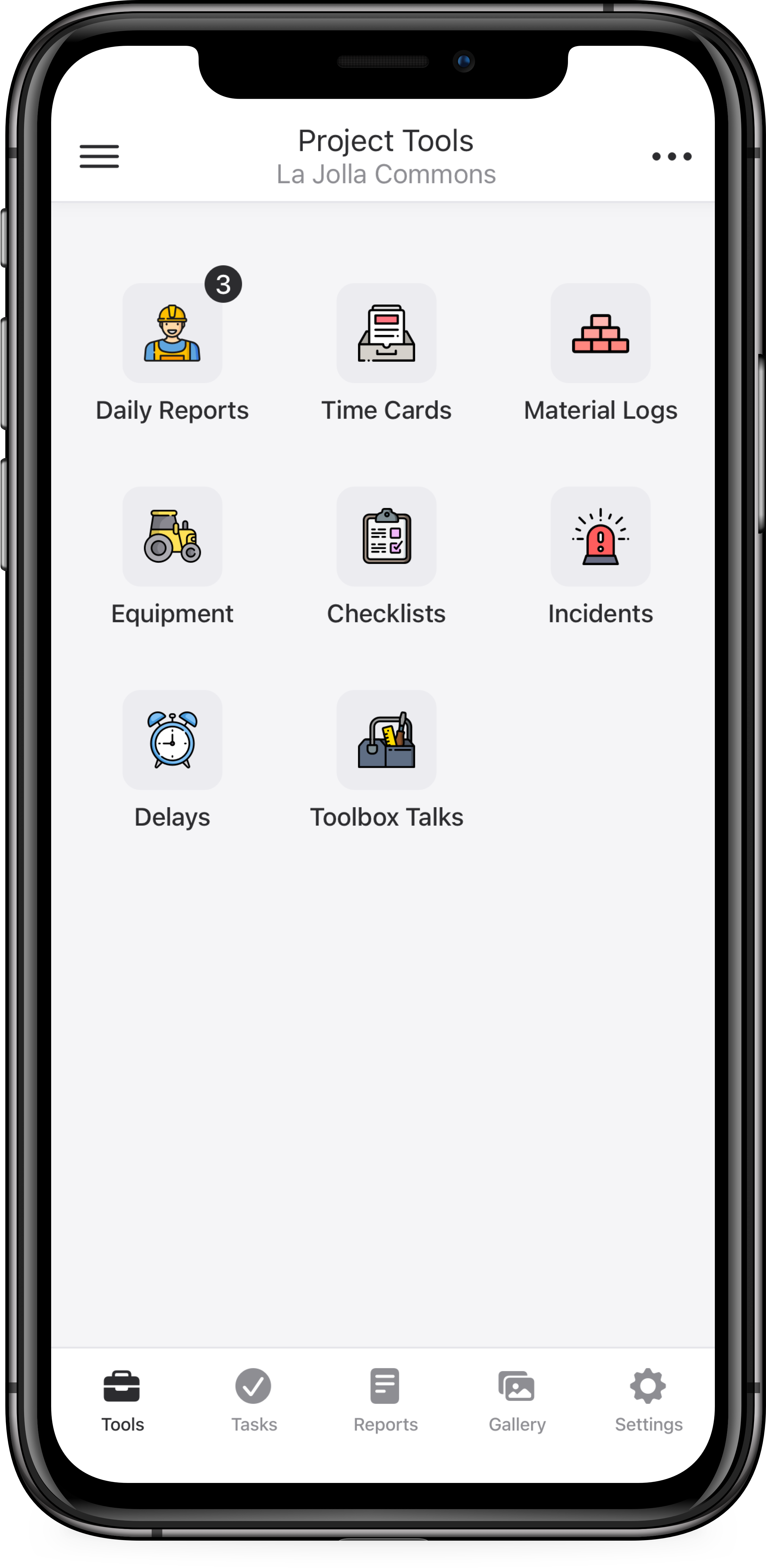
I needed a layout that was straight-forward and easy to understand: I landed on the layout above because it offered simplicity and the flexibility to add or remove features based on plan type, user type, or company customization.
Early signals have been promising: internal stakeholders and customers like being able to navigate their project settings all from a single menu. For our users, having a reliable app to perform their work activities is a must and though the app has confusing layouts and poor interactions, they had become accustomed to them. Our strategy is to slowly release the redesign in chunks.
This project is ongoing and slated to be completed June 2021.